Make sure your presentations do not jeopardize the upstream effort and convey the right messages to your audience.
Data visualization is a key step in the process of retrieving valuable insights from the data. After doing the hard work (data collection, integration, curation, discovery…etc.) you will have to share your findings. You would certainly need to represent the data in such a way that you can convey these findings to your target audience. It’s really important therefore to make sure your presentations are accurate and effective.
The process of transforming abstract data (Nominal, Ordinal, Quantitative and Relational) into visual data is an attempt to leverage the power of pre-attentive processing of visual information. By doing so, you enable your audience to absorb the information effortlessly.
Pre-attentive visual variables are things like length, width, size, colors, contrast, line ends… and so on.
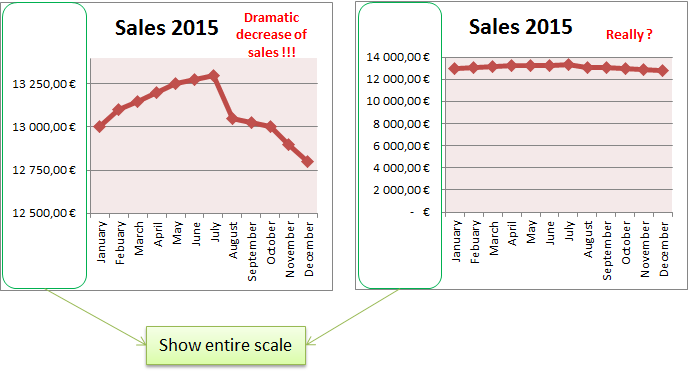
- Show complete scale
-
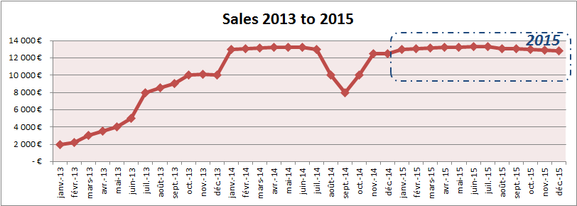
Show data in context
The same example above represented in a 3 years context, convey a totally different view of the information :
-
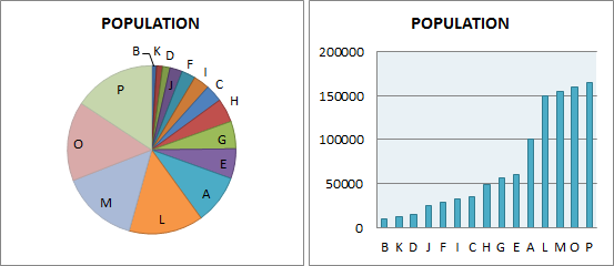
Use visual variables appropriate to the data
As example, if your primary focus is to represent a set of numbers of different magnitudes, a bar chart is certainly better than a pie chart. Indeed, a pie chart relies on two things: colors to differentiate nominal data and angle to convey quantity. A bar chart relies on height which is a far better conveyor of quantity than angle. Below is an example of two charts representing the size of different cities population:
- Avoid multidimensional artifact to represent the same abstract data
Using multidimensional artifact (height, width, volume, color…etc.) to represent the same information can lead to many different interpretation. You don’t want to let your audience guessing the information.
-
Avoid false perspective
A good way to describe false perspective is the lie factor concept: size of effect in graph by size of effect in data. In the example below, the data shows a population growth of 50% in five years, whereas the data visualization shows a growth of 500%.
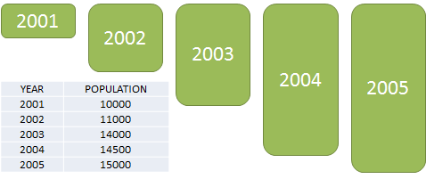
My advice is to keep the lie factor close to 1.
Failing to follow these basics principles, can be misleading and jeopardize the entire effort done upstream.
© Copyright Certosa Consulting – All Rights Reserved. Unauthorized use and/or duplication of this material without express and written permission from this site’s author and/or owner is strictly prohibited. Excerpts and links may be used, provided that full and clear credit is given to Pastel Gbetoho and Certosa Consulting with appropriate and specific direction to the original content.