I have explained in a previous post the importance of data visualization and emphasized pitfalls to avoid in order to create effective visualization. In the quest of deriving valuable insights from your data, you will certainly need to visualize and share your findings. Therefore you need to empower the data consumers with the tools to achieve this goal.
There are various data visualization tools on the market that promise seamless integration with your data management platform. Tableau is one of these softwares. It’s listed among the top leaders of the business intelligence and analytics platform in Gartner magic quadrant.
One of the key advantage of Tableau is that it provides non technical user the ability to build complex reports and dashboard without any coding skills. You can get for free Tableau desktop to familiarize yourself with the tool.
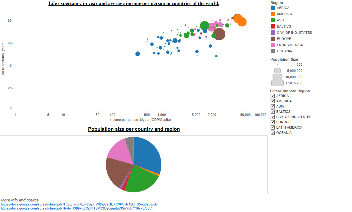
Below is a dashboard that can be created by a non technical user in less than 10mn. Click on the chart to interact with the viz.
If you want to try yourself, you can get the data set here and follow the instructions below. The data set has been extracted from the data sources listed on the dashboard.
Import your dataset and create a first sheet for the bubble chart:
- X Axis (Columns) -> Sum of gdp_2011.
- Y Axis (Rows) -> Sum of life_2015
- Region is used as ‘Color’ dimension
- Area is used as ‘Size’ dimension
- Logarithmic scale is used for the X Axis
Create another sheet for the pie chart. This type of chart is pretty straight forward with Tableau:
- region, country as the dimensions
- population as the measure
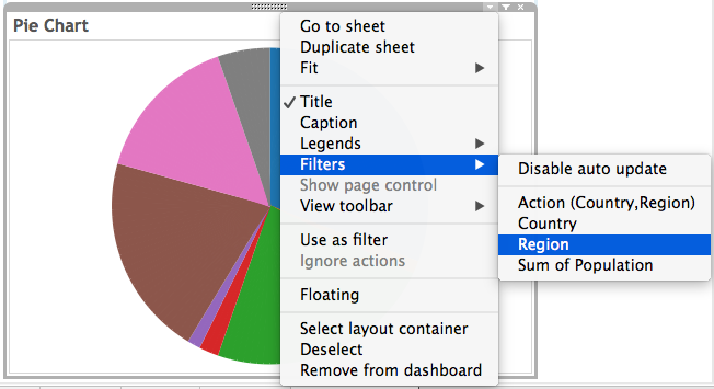
Finally create a dashboard with these sheets. You will notice various filter options in the right panel, that enables you to filter per region or compare two or more regions. This kind of interaction can be added in one click. See below an example for the pie chart:
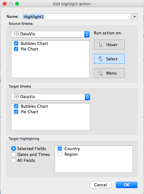
Another great way to control how user action will affect the dashboard is to define actions. Simply select in the menu “Dashboard -> Actions… -> Add Action”. In the example above, I have added a highlight action, so that when the user selects a country in of these sheets, the data for this specific country will be highlighted in the dashboard:
Congratulations for your first report.
© Copyright Certosa Consulting – All Rights Reserved. Unauthorized use and/or duplication of this material without express and written permission from this site’s author and/or owner is strictly prohibited. Excerpts and links may be used, provided that full and clear credit is given to Pastel Gbetoho and Certosa Consulting with appropriate and specific direction to the original content.
